How to Set Up Design Files for Letterpress Plates
If you are sending us files to turn into plates, we require the following:
- Files must have vector artwork.
- Type must be outlined.
- Colors should be set to spot colors. Please provide swatches for color matching, (Pantone numbers are welcome and encouraged.)
- Bleeds pulled to .125”.
- Export to a PDF with crop marks.
- No line weights under .25pt.
- All type should be 6pt. or larger.
-
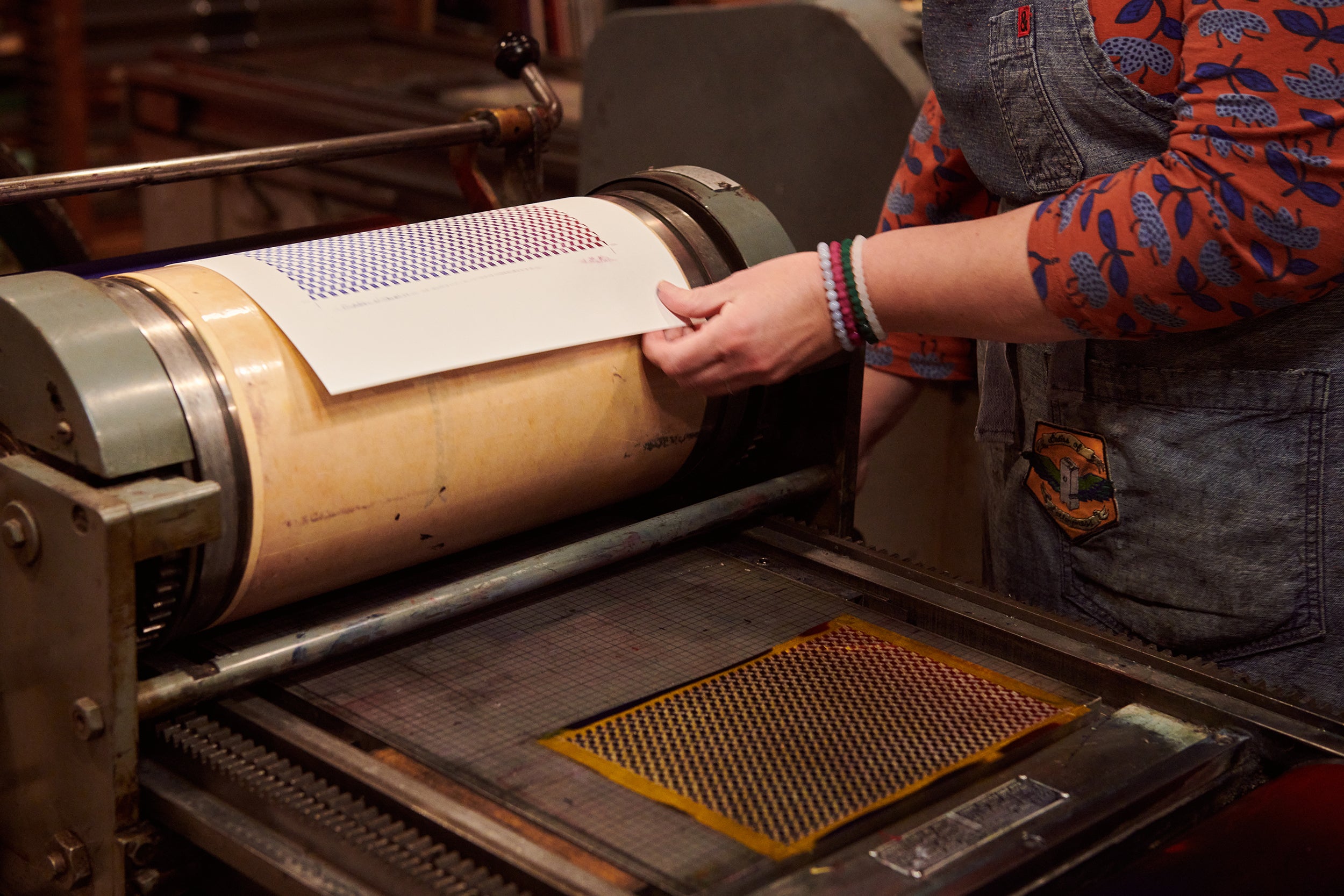
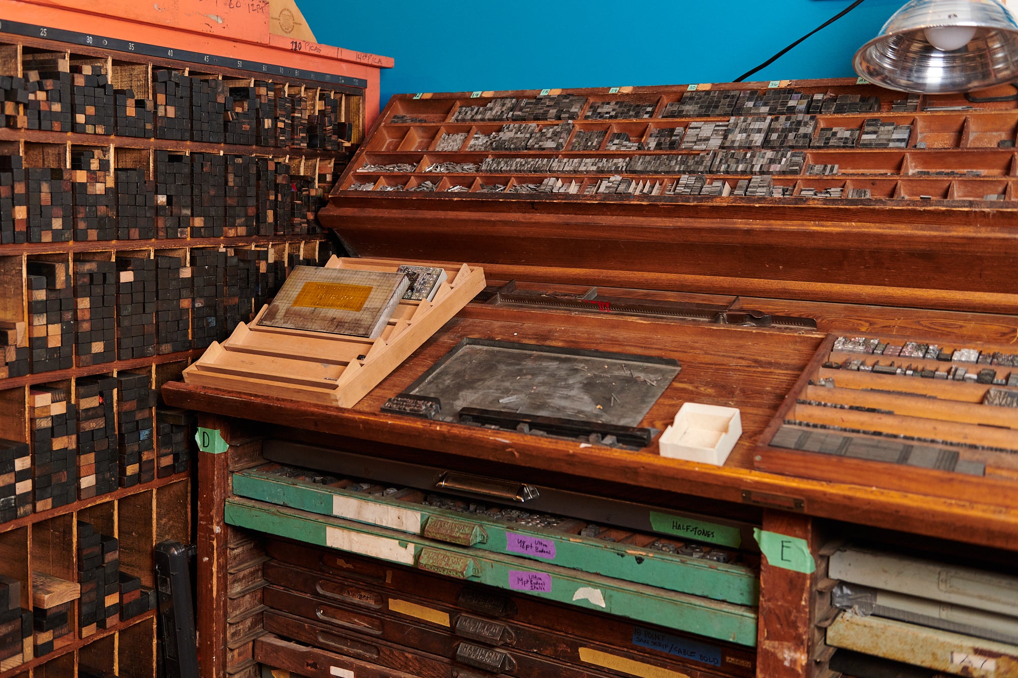
Letterpress is a relief printing process wherein metal type, plates, linocuts, images, or photopolymer plates are locked into the bed of a press, inked via rollers or brayers, and paper is pressed onto it to transfer the ink from the plates to the paper.
-
Designing for letterpress is a perfect balance between design, paper, ink, and process, in which all of these things work towards a beautiful final product. Think of it as 3D, versus 2D. Something that looks fantastic on your screen might not be as successful when we get it on press. We have the experience to guide you on your design.
-
Letterpress shines with fewer colors. The majority of custom projects are 1, 2, and 3 color prints.
A few notes:
- Black is a color.
- Blind impression (no ink) is a color. It is a great way to go, but make sure your paper and design choice are going to support the level of impression needed to make a blind impression readable.
- Letterpress ink is transparent, so when you layer two colors, it creates a third (think blue and a yellow overlapping to create green).
- The paper will run through the press for each color (or blind impression), so the more colors, the more compressed the paper is and the harder it is to get a deep impression (if impression is important to you).
- We use the Pantone Matching System (PMS) for ink mixing and choices of colors. Do not trust the color on your screen to be the color of the ink. Always check against an uncoated PMS book (we have one you can reference if you need one).
- We will note the number of colors in your estimate and invoice as 1/0, 2/0, 2/1, etc..., which means one color on one side/none on the other, two colors on one side, none on the other, or two colors on one side/one on the other, and so on...
-
We are paper people, and love paper of all types! Our favorites are cotton, including Reich Savoy, Strathmore, Arturo, and Crane’s Lettra; and we like woodpulp ones like French Paper Company, Mohawk, Neenah, chipboard, etc. We have samples of all of our favorites in our studio and would be happy to pore over sample books with you. If you want something that we do not have, we will do our best to point you in the right direction on your paper search.
A few things to remember:
- Softer papers (cottons, bamboos, etc…) are going to give you the most “loft” to gain the most impression.
- Harder papers (wood pulp, plastics), are going to be more limiting on impression.
- Color of paper can change the appearance of specific inks and Pantone colors. Dark paper will show through most inks.
- Floods on uncoated papers will result in the classic letterpress “salty” texture, which is a result of the ink layer interacting with the paper and creating a unique mottled look.
-
Because of the way that the plates are inked and paper is pressed into it, letterpress can have an impression on most papers. Our printers are able to control that depth, but here are some things to remember:
- If you are looking for a deep impression, remember that it is easier to impress the positive (type, images, lines) as opposed to a large area of color around type or images. Think of trying to sink a sheet of plywood into water - it is easier to submerge it when you have it on end, as opposed to laying it flat and pressing down.
- If you do NOT want an impression, please let us know. (Fun fact: originally ALL letterpress was assumed to have NO impression. So - props for keeping historically accurate!)
- Paper choice matters GREATLY if you are wanting a deep impression. See below for more information.
- Remember that if we are seeking a very deep impression, you will most likely see the result of this on the opposite side, what we call “bruising.” Thick papers will bruise less than thinner ones.
- With large print projects (8x10 and up), it is hard to get a deep impression because of the area that is being impressed simultaneously.
We can "spot impress" specific areas of a design so that one place has more impression than others. This may incur an additional set-up cost.
-
We print business cards, invitations, envelopes, labels, tags, book covers, posters, bags...most anything that can be printed on paper! And we love a challenge, so ask us if you’re planning something different!
-
- Bruising: The area on the reverse side of a print that is “pushed out” due to deep impression.
- Salty: The mottled ink area in a large section of print that is caused by the layer of ink and how it interacts with the plate material, how it is transferred to the paper, and the texture/tooth of the paper itself.
- Flood: A large section of similarly-leveled area in a print design. Type or images may be “knocked out” to use the paper color as the relief color in the flood.
- Embossing: A raised area of type or design created by pressing paper between a male-female die set. The reverse, or the “deboss” is clearly seen on the opposite side of the paper.
- Debossing: An indented area of type or design created by pressing paper between a male-female die set. The reverse, or the “emboss” is clearly seen on the opposite side of the paper.
- Blind Impression: A letterpress impression with no ink.
-
Designing for letterpress is a perfect balance between design, paper, ink, and process, in which all of these things work towards a beautiful final product. Think of it as 3D, versus 2D. Something that looks fantastic on your screen might not be as successful when we get it on press. We have the experience to guide you on your design.
-
A few reasons:
- Expertise: We are specialized artists trained to use our equipment safely, properly, and expertly. It’s more than pushing “print” on a computer screen (though that would be nice!), and we have put in the time to get the experience needed to get reliable, quality results for your project.
- Time: Most of our projects are printed one piece of paper at a time. This ensures that the result is beautiful, precise, and of the highest quality.
- Equipment: Our presses are amazing machines, and most of them are 75-150 years old. The phrase “they don’t make them like they used to” is, quite literally, very true for us. We, unfortunately, can’t go on Amazon and buy new ones. When they break, we grab ourselves a wrench and fix them ourselves (or work with the 1 or 2 specialists in the country to help out). And when new parts are needed, they must be specially machined because they literally don’t exist anymore.
-
From the time we receive your final files and a 50% deposit, we generally need 10-15 business days to complete your order. Additional finishes (gold foiling, edge painting, beveling, corner rounding, drilling, calligraphy, etc…) may add more time to your order. You will be given a more specific turnaround time at the beginning of your order.
-
Order Timeframes
Orders placed by noon EST will ship within 1-2 business days. Orders placed after noon EST will ship within 2-3 business days. All packages are shipped USPS from our Worthington, Ohio studio.
International Orders
International shipping is available, but we cannot promise package arrival dates. We are also not responsible for additional custom tariffs or charges imposed on your package.
Lost or Damaged Orders
Items damaged in shipping will be replaced at no charge to our customer. Items lost in delivery are the responsibility of the USPS and will not be replaced by Igloo Letterpress.
Timelines
We do not ship on Sundays or Mondays or major holidays. We appreciate your order and will do our best to accommodate requests for expedited shipping.
Please contact us at info@iglooletterpress.com with further questions.